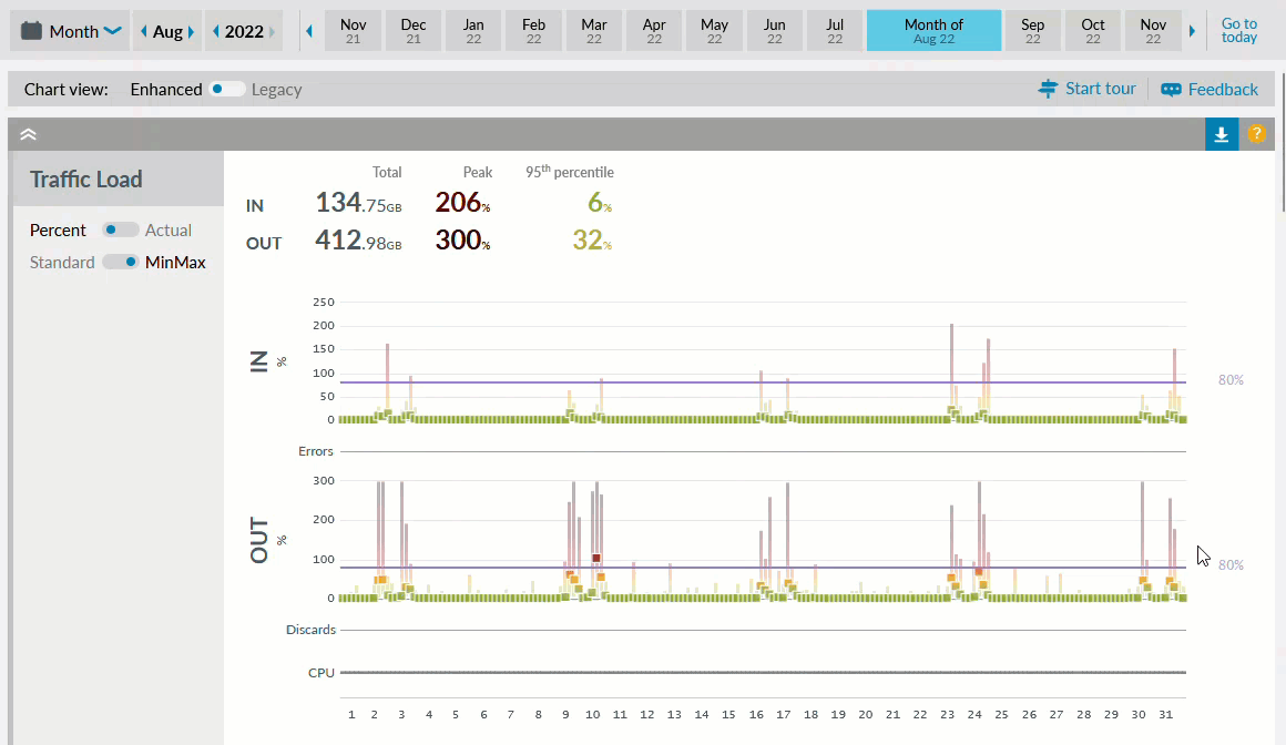
Traffic Load
Overview
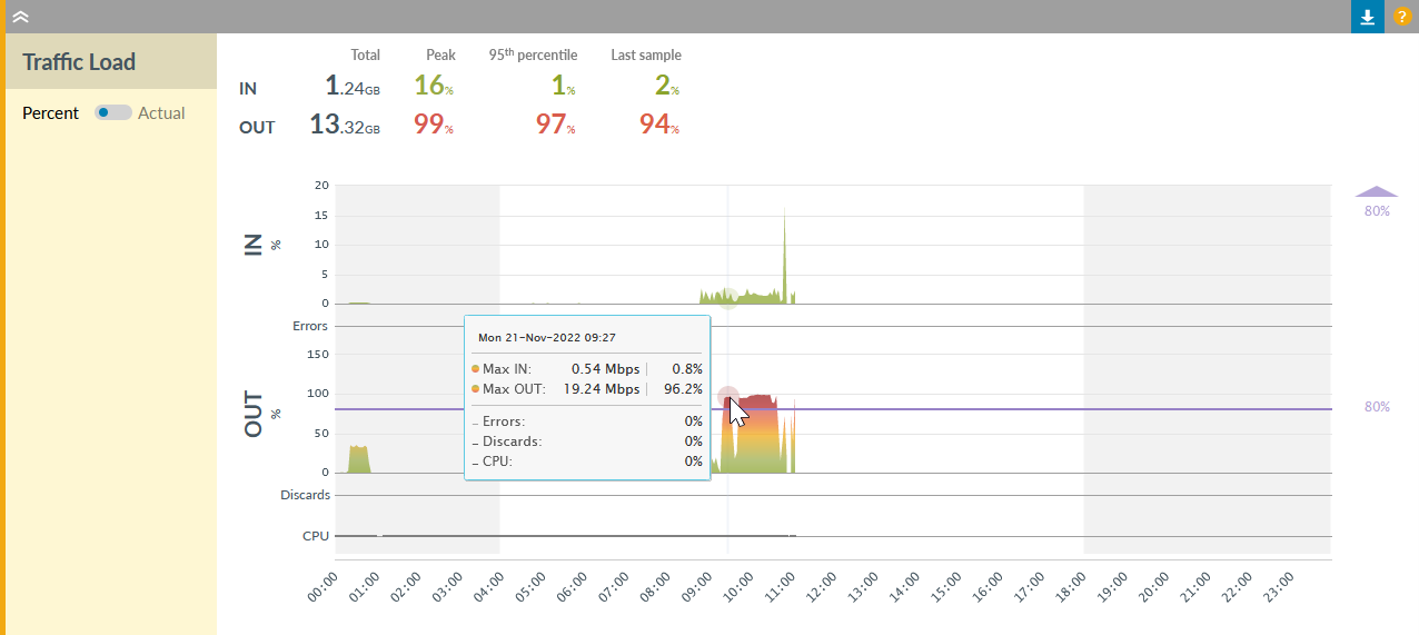
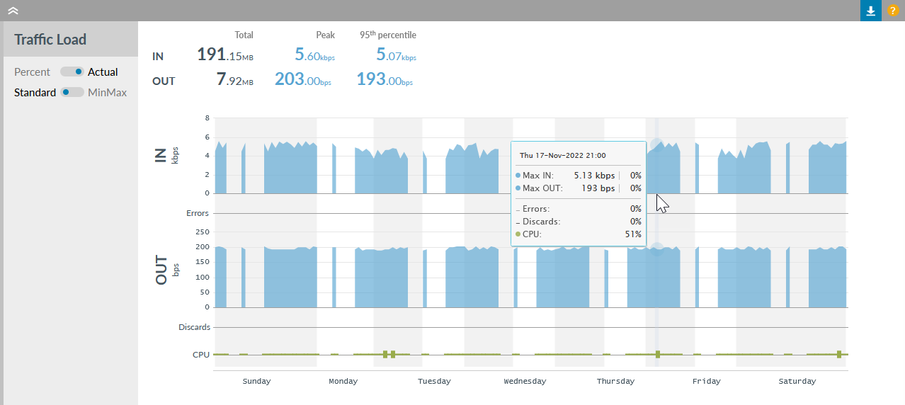
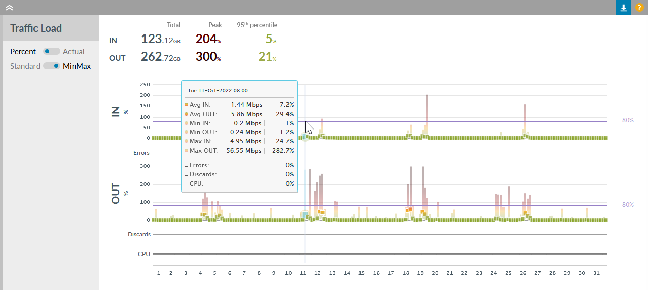
Traffic charts display the total volume in (upper) and out (lower) for the selected time period.
Sidebar options and colour coding
- Percent Actual
- Percent: Selected by default, show data received or sent as a percentage of the bandwidth, percentage is capped at 300%
Actual: Show volume of data received or sent - Standard MinMax
- Available on week or month only
Standard: Selected by default, shows an area chart using the maximum value as the data point
MinMax: Shows an average point and a vertical gradient bar for the minimum and maximum values recorded for the time period
- If you click, hold and drag across the chart to zoom in then this button appears in the top right of the chart - click to revert to the full time period, see separate section on zoom options for GIF examples
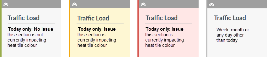
When viewed for today only, the sidebar for each section on the Details page gives an indication if it is currently impacting the associated heat tile colour. This applies for collapsed sections also.
Dormant watches are not expected to pass traffic so a small amount in or out (more than 1000 Kbps by default) changes the side bar colour. Find out more about alerting thresholds.
Saved settings
The settings below will be remembered when you next log in.
- Whether the panel is collapsed or expanded
- The status of any toggles
Traffic Load description
- Download the traffic information to a CSV file, see separate section on Download option below
- Vertical axis
- Changes from "%" when Percentage selected and "bps" when Actual selected - hover on the chart to see exact values. Note: scaling may adjust units depending on the volume
-
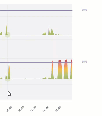
80% - On the percentage chart only, the threshold is shown as a horizontal purple line on the chart with the actual threshold value on the far right.
The default threshold is 80% and Admin users can set a custom threshold. If configured, a load alert can be sent when the traffic load approaches the threshold.
If the adjusted vertical axis means the threshold line is not visible then a purple arrow is shown indicating the threshold is above the visible chart area. - Horizontal axis
- Adjusts according to the selected time period to show "hours" in day view and "days" in week and month views; redraws if the time zone is changed at the top right of the Details page
- Zoom options
- Drag: click, hold and drag across the chart to zoom into a time period; repeat if needed and if complete
Note: all new chart types are synchronised so they zoom in and out together
Click: on a week or month view, click on the chart to jump to that specific day view
See separate section on zoom options for GIF examples
| Colour | Percentages | Meaning |
|---|---|---|
| 300% | Percentages are capped at 300% | |
| 200% | ||
| 101% | Greater than the bandwidth of the line | |
| 100% | The configured or discovered bandwidth of the line | |
| 80% | By default, Highlight alerts at 80% | |
| 60% | ||
| 20% | ||
| 0% |
Highlight displays the load value for each data point in the time period:
- Day
- Shows multiple data points per hour (one for each polling period, usually one to five minutes)
- Week
- Shows 24 data points per day (every hour), in MinMax view, Average for each hour is shown along with MinMax values
- Month
- Shows 6 data points per day (every 4 hours), in MinMax view, Average for each 4 hour period is shown along with MinMax values
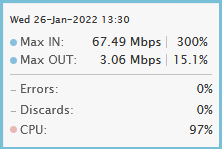
Day view and Week/Month view with "Standard" selected. Hover on a point to see timestamp and Max for In and Out as actual values and percentages. Errors/Discards and CPU are included.
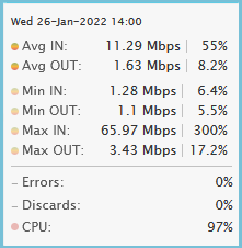
Week/Month view with "MinMax" selected. Hover on a point to see timestamp, then Avg, Min and Max for In and Out as actual values and percentages of the bandwidth. Errors/Discards and CPU are included.
Summary
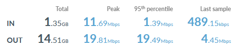
The summary shows the total values, peak and 95th percentages for in and out during the selected time period
The values shown change based on the selection of Percent or Actual in the side bar.
Percent values are coloured on the same gradient as the chart, from green meaning light load, to orange and red as the value approaches 100% of the bandwidth and deeper reds above 100%.
Actual values are blue to indicate neither good nor bad.
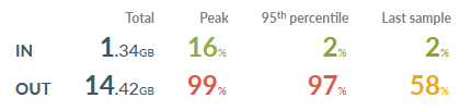
- Total
- Shows the accumulated volume of traffic for the time period displayed, calculated by adding the volumes from the polled samples. This value is the same with Percent or Actual selected.
- Peak (Percent)
- The bits per second values reported are taken from the individual sample with the highest percentage of the configured/discovered line speed for the time period displayed. It will be seen as the highest point on the chart.
Percentage can exceed 100% if bursting is permitted on the line or the line speed in Highlight is lower than the configured or discovered bandwidth. - Peak (Actual)
- The bits per second value reported is from the individual sample with the highest throughput for the time period displayed. It will be seen as the highest point on the chart. The Highlight peak therefore is the sample with the largest volume, divided by the number of seconds between samples (typically 180 or 60). Note: This may vary from the peak reported on a network device which would use a different measurement interval.
The peak bps figure may differ from the peak bps on the Percentage chart if the Highlight bandwidth has changed during the day. See Troubleshooting traffic load for more details. - 95th percentile
- The highest recorded value during the time period ignoring the top 5%, read more about the 95th percentile and why it's useful
- Last sample
- Only shown for today, this is the last recorded value (the last good sample) for today with ? shown if no data was received
Errors/Discards and CPU utilisation
Errors are inbound line errors (such as CRC and frame errors). Line errors are not available for Class of Service watches.
Discards are the outbound issue of packet loss.
Both are measured as a percentage of overall packets received (Errors) or sent (Discards). Hover on the chart to see timestamp and precise values. Colours on the line are:
| Colour | Ignored | |||||
|---|---|---|---|---|---|---|
| Errors/Discards | Up to 0.10% | 0.11 to 0.50% | 0.51 to 1.00% | 1.01 to 2.50% | 2.51 to 5.00% | Greater than 5.00% |
Custom defined Alerting threshold: Bearers - Congestion & Errors
By default, line errors and discards greater than 1.00% will cause the heat tile to change colour and generate an alert if one has been set up. Admin users can set a custom threshold.
From the Traffic Load title bar you can download to a CSV file the errors and discards data from each poll, see separate "Download option" section for more details.
CPU utilisation is shown as a grey line if unavailable or a thicker green line up to 50%. Hover on the chart to see timestamp and precise values. Above 50% it's shown in coloured blips:
| Colour | Grey line | Green line | ||||
|---|---|---|---|---|---|---|
| CPU util | 0% | Up to 50% | 51% to 65% | 66% to 80% | 81% to 95% | 96% to 100% |
Highlight does not change the colour of heat tiles nor send alerts for CPU utilisation.
Note: CPU utilisation may not be available, depending on the equipment manufacturer.
Zoom options
There are two methods to zoom in on charts: drag and click. All charts on the details page are synchronised so they zoom in and out together or the whole page jumps to a date on click.
Download option
From the Traffic Load title bar you can download to a CSV file the traffic information which created the displayed charts.
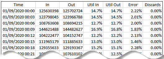
The columns in the download are:
- Time
- the date and time of each sample (matching the time zone selected on the Details page)
- In
- the total bytes received since the previous sample
- Out
- the total bytes sent since the previous sample
- Util In
- the average speed of traffic calculated from the received bytes value during this time period, expressed as a percentage of the configured/discovered bandwidth In (see example below)
- Util Out
- the average speed of traffic calculated from the sent bytes value during this time period, expressed as a percentage of the configured/discovered bandwidth Out (see example below)
- Error
- the number of errors reported in this time period expressed as a percentage of the number of packets received
- Discards
- the number of discarded packets reported in this time period expressed as a percentage of the number of packets sent
For SD-WAN tunnels, disregard the columns Util In, Util Out, Error and Discards as the data is not returned
Utilisation example
If 491595485 bytes are received over a 3 minute period on a 50M line, the Utilisation is calculated as:
491595485 * 8 = 3,932,763,880 bits
/ 180 = 21,848,688 bits/sec
/ 1,000,000 = 21.85Mbps
/ 50M *100 = 43.7% utilisation
Utilisation note
The timespan used for calculations of utilisation can vary by a few seconds from the specific poll interval. This may be caused by a number of factors including:
- SNMP retries
- slow device responses
- resource contention on the poller
This variation is taken into account when Highlight calculates the utilisation which is presented on screen and in the Utilisation columns. This can lead to differences in utilisation calculations if attempts are made to reverse the calculation assuming a specific poll interval.
Background colours
Grey/White backgrounds - Business hours
By default, the chart shows non-business hours with a vertical grey background and business hours with a vertical white background on day and week views. Business hours are not shown on a month view. Toggle off to show alternate horizontal grey and white background areas.
Business hours are the time periods (to the nearest hour) that a business is operational. Highlight uses business hours when displaying charts on the Details page, filtering reporting results and generating alerts. Default values are 06:00 to 18:00 Monday through Friday with Saturday and Sunday excluded. However, you may see different settings if the business hours on a parent folder or location have been changed. Business hours reflect the local time zone for the location.
Find out more about business hours.
Purple backgrounds - Maintenance
Any purple background areas on the chart show current and past maintenance periods. Watches in maintenance do not send alerts, change the colour of heat tiles or decrement the availability figure for the time period.
Find out more about maintenance indicators on the details page.